Every Power BI developer who has used Power Query in Power BI desktop for data wrangling would have sailed through this issue.
I can use “Query dependencies” to see the “big picture” view of how my queries are related, but I can’t see the “detailed” view of queries inside “Query dependencies“.
– or –
I can’t quickly understand how data is extracted and transformed across queries.
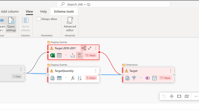
In this example, we will start with Power Query editor in Power BI desktop. There are three queries – Target 2010-2011, TargetQuantity and Target, and one parameter.
Queries pane in Power Query editor within Power BI desktop
Select the Query dependencies feature in View tab of Power Query editor.
The query dependencies display the names of the queries and parameters with their dependencies. Selecting a parameter or a query highlights its related items
Query dependencies in Power Query editor within Power BI desktop
What “Query dependencies” lacks is that we can’t expand the queries to see the individual steps. So, I need to close the “Query dependencies” window and switch to the query to see its steps.
This kills our time as we need to switch back and forth between query dependencies window and the query.
Don’t worry! You can use the below trick to see both the “big picture” view and “detailed” view of the steps in Power BI service.
Answer: Dataflows!
Create a dataflow in your app workspace with a blank query or blank table. This blank query/table can be deleted later as it doesn’t serve any purpose in this scenario.
Dataflow
Multi-select the groups or individual queries in Power Query editor within Power BI desktop. Copy it (Ctrl + C)!
Back to dataflows. Paste the copied items (Ctrl + V)!
Power Query editor in Power BI dataflow
It is usual to see errors against these pasted queries as it references on-premises data sources for which gateway is not configured! Just ignore these errors.
Select the diagram view in View tab or Diagram view. This view looks quite like query dependencies in Power BI desktop, but it is not!
You can expand/collapse the queries …
You can highlight related queries …
You can author new queries as well as do step level actions …
Conclusion:
Until Power Query within Power BI Desktop is upgraded with the above feature, just copy, and paste your queries to a dataflow to take advantage of the Diagram view feature.
Have you enabled a feature to “Entire organization” in tenant settings? Have you shared a report or app to “Entire organization”?
If yes, are we referring to the same set of users in tenant settings and in workspaces? This blog post is to help you understand the differences.
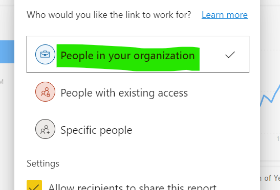
You might have noticed the wording “Entire organization” and “People in your organization” in many places within Power BI service.
We will start this blog post with who are the users in my Azure AD. It has two internal users, and one external user (guest).
Let’s say you have an app workspace that has three items – dataset, report, and dashboard.
Workspace items
You used the “Share” feature of the report to share the report “Customer Statistics” with “People in your organization“. Then, you create an app with the report and dashboard as items, and granted access to everyone in “Entire organization“
Sharing report to “People in organization”Grant access to “Entire organization” to install and access the app
Will the shared content be accessible by both internal and external users? Take a moment to think!
The wording “Entire organization” or “People in your organization” WITHIN the workspace refers to internal users only. Yes! External users will not be able to access these items unless you have granted explicit access to them. If you need to give access to external users, then give them direct access on the Manage Permissions page of the report, and for apps grant access to both internal and external users using “Specific users or groups”.
Now, let’s turn to the “Tenant settings” page. Many of the settings on this page have “The entire organization” as one of the options.
Let’s say you don’t want “External users” to export reports as PowerPoint presentations or PDF documents.
As per the definition of “Entire organization” in the previous segment, it includes internal users only. So, let’s apply “Export reports as PowerPoint presentations or PDF documents” setting to “The entire organization“.
The external user can export the files as presentation and PDF.
What is the reason for this behavior?
In Tenant Settings, “Entire organization” includes all users – both internal and external users. So, if you want to restrict or allow only a subset of the users to use a feature, then add them to a security group and apply the setting to “Specific security groups“.
In the above data model, Product has one-to-many relationship with Sales on ProductID column.
Total Sales Order Qty = SUM(Sales[OrderQty])
Assume you have a table visual with Product[Color] and above measure. It is obvious you know what the result will be. The visual will list the total sales order quantity against each product color.
How will the query engine calculate the result: Will it query the Product table first to get the colors, and then the Sales table to get SUM(Sales[OrderQty]) for each color returned by the previous query?
Before you start reading further, you should know that table expansion happens only to tables with regular relationship (one-to-one or many-to-one on tables in the same island or continent).
When is it expanded? What will be included when a table is expanded? Does this increase the size of the data model? Let’s find out.
In the above data model, Sales and Product table are imported. They have many-to-one relationship. When a calculated column in Sales table uses RELATED() function on a column of the Product table (or) when a measure aggregates the value in Sales table is evaluated, only then Sales table is expanded. This means, when the Sales table is queried, it will include related and relevant fields from the Product table by using left outer join.
Measure #1Total Sales by Sale’s Unit Price
Total Sales by Sale's Unit Price =
SUMX(
    Sales,
    Sales[OrderQty] * Sales[UnitPrice]
)
Scenario 1: Total Sales by Sale's Unit Price measure is the only field used in the visual. What will be the result?
Did table expansion happen? Filter context is empty. No field of Product is referred within and outside this expression. So, storage engine executes only one query on the Sales table. Sales table is not expanded.
SET DC_KIND="AUTO";
WITH
	$Expr0 := ( PFCAST ( 'Sales'[OrderQty] AS  INT ) * PFCAST ( 'Sales'[UnitPrice] AS  INT )  )
SELECT
SUM ( @$Expr0 )
FROM 'Sales';
Scenario 2: Product[Color] column and Total Sales by Sale's Unit Pricemeasure are used in the visual. What will be the result?
Did table expansion happen? Yes. Total Sales by Sale's Unit Price measure is evaluated for each product color. So, the Product[Color] is in the filter context. As, Product table is on the one-side of the relationship with Sales table, storage engine expands the Sales table to include Product[Color] and its total sales by executing a single left outer join query between Sales table and Product table [line 7, 8]. Grant total 714002.9136 is calculated by the formula engine.
SET DC_KIND="AUTO";
WITH
	$Expr0 := ( PFCAST ( 'Sales'[OrderQty] AS  INT ) * PFCAST ( 'Sales'[UnitPrice] AS  INT )  )
SELECT
'Product'[Color],
SUM ( @$Expr0 )
FROM 'Sales'
	LEFT OUTER JOIN 'Product' ON 'Sales'[ProductID]='Product'[ProductID];
Measure #2 Total Sales by Sale’s Unit Price with Order Qty > 2
Total Sales by Sale's Unit Price with Order Qty > 2 =
CALCULATE(
    SUMX(Sales, Sales[OrderQty] * Sales[UnitPrice]),
    Sales[OrderQty] > 2
)
Scenario 1: Total Sales by Sale's Unit Price with Order Qty > 2 measure is the only field used in the visual. What will be the result?
Did table expansion happen? As there are no filters from the visual, the filter context is empty. CALCULATE creates a new filter context within which SUMX() will be evaluated. This new filter context is populated with one filter parameter Sales[OrderQty] > 2. As there is no reference to any field from the Product table, Sales table is not expanded. So, storage engine executes only one query on the Sales table.
SET DC_KIND="AUTO";
WITH
	$Expr0 := ( PFCAST ( 'Sales'[OrderQty] AS  INT ) * PFCAST ( 'Sales'[UnitPrice] AS  INT )  )
SELECT
SUM ( @$Expr0 )
FROM 'Sales'
WHERE
	 ( PFCASTCOALESCE ( 'Sales'[OrderQty] AS  INT ) > COALESCE ( 2 )  ) ;
Scenario 2: Product[Color] field and Total Sales by Sale's Unit Price with Order Qty > 2 measure are used in the visual. What will be the result?
Did table expansion happen? For each row in the table visual, the filter context contains a different value for the Product[Color].CALCULATE creates a new filter context within which SUMX() will be evaluated. This new filter context is populated with two filter parameters: Sales[OrderQty] > 2 and Product[Color] from the original filter context. Since Product[Color] is on the one side of the relationship, storage engine expands the Sales table by executing a single left outer join query between Sales table and Product table [line 7, 8] to fetch the total sales by product color with Sales[OrderQty] greater than 2 [line 10].
SET DC_KIND="AUTO";
WITH
	$Expr0 := ( PFCAST ( 'Sales'[OrderQty] AS  INT ) * PFCAST ( 'Sales'[UnitPrice] AS  INT )  )
SELECT
'Product'[Color],
SUM ( @$Expr0 )
FROM 'Sales'
	LEFT OUTER JOIN 'Product' ON 'Sales'[ProductID]='Product'[ProductID]
WHERE
	 ( PFCASTCOALESCE ( 'Sales'[OrderQty] AS  INT ) > COALESCE ( 2 )  ) ;
Measure #3 Total Sales by Sale’s Unit Price with Order Qty > 2 (Filter function)
Total Sales by Sale's Unit Price with Order Qty > 2 (FILTER function) =
CALCULATE(
    SUMX(Sales, Sales[OrderQty] * Sales[UnitPrice]),
    FILTER(
        Sales,
        Sales[OrderQty] > 2
    )
)
Scenario 1: Total Sales by Sale's Unit Price with Order Qty > 2 (Filter function) measure is the only field used in the visual. What will be the result?
Did table expansion happen? As there are no filters from the visual, the filter context is empty. As the filter context is empty, FILTER() doesn’t execute query on the storage engine rather Sales[OrderQty] > 2 is added to a new filter context within which SUMX() will be evaluated. This new filter context is populated with one filter parameter Sales[OrderQty] > 2. As there is no reference to any field from the Product table, Sales table is not expanded. So, storage engine executes only one query on the Sales table.
SET DC_KIND="AUTO";
WITH
	$Expr0 := ( PFCAST ( 'Sales'[OrderQty] AS  INT ) * PFCAST ( 'Sales'[UnitPrice] AS  INT )  )
SELECT
SUM ( @$Expr0 )
FROM 'Sales'
WHERE
	 ( PFCASTCOALESCE ( 'Sales'[OrderQty] AS  INT ) > COALESCE ( 2 )  ) ;
Scenario 2: Product[Color] field and Total Sales by Sale's Unit Price with Order Qty > 2(Filter function)measure are used in the visual. What will be the result?
Did table expansion happen? Table expansion happens twice.
At the time of calling the measure, the filter context is not empty. It includes Product[Color]. As the filter context is not empty, FILTER() expands the Sales table to select Sales[OrderQty] and Product[Color] with order quantity greater than two.
SET DC_KIND="AUTO";
SELECT
'Product'[Color], 'Sales'[OrderQty]
FROM 'Sales'
	LEFT OUTER JOIN 'Product' ON 'Sales'[ProductID]='Product'[ProductID]
WHERE
	 ( PFCASTCOALESCE ( 'Sales'[OrderQty] AS  INT ) > COALESCE ( 2 )  ) ;
Then, CALCULATE creates a new filter context within which SUMX() will be evaluated. This new filter context is populated with two filter parameters: Sales[OrderQty] > 2 and Product[Color] from the result returned by FILTER(). Since Product[Color] is on the one side of the relationship, storage engine expands the Sales table again by executing the second left outer join query between Sales table and Product table [line 7, 8] to fetch the total sales by product color with Sales[OrderQty] greater than two [line 10].
SET DC_KIND="AUTO";
WITH
	$Expr0 := ( PFCAST ( 'Sales'[OrderQty] AS  INT ) * PFCAST ( 'Sales'[UnitPrice] AS  INT )  )
SELECT
'Product'[Color], 'Sales'[OrderQty],
SUM ( @$Expr0 )
FROM 'Sales'
	LEFT OUTER JOIN 'Product' ON 'Sales'[ProductID]='Product'[ProductID]
WHERE
	 ( PFCASTCOALESCE ( 'Sales'[OrderQty] AS  INT ) > COALESCE ( 2 )  ) ;
Conclusion:
When the filter context is empty, FILTER() doesn’t expand the Sales table otherwise it expands Sales table if FILTER() is called on a table. As we don’t have control on whether the filter context will be empty or not, we have two choices to avoid expanding Sales
In this blog post, I will share the easiest method to bring data from the shared dataset to Excel sheets using “Featured tables”.
Remember, your users must be an Excel subscriber with Microsoft 365 and have Pro license to use the featured tables. Your Power BI admin should have enabled “Allow connections to featured tables” in your organization tenant.
Featured tables are a way to link your data in Excel to data in Power BI. These tables will be listed in Data Types gallery in Excel.
Identify the tables in your dataset that your users would be interested in. Set “Is featured table” to Yes to these tables. Featured tables in DirectQuery datasets and live connect datasets won’t be listed
Set “Key column” field to unique id of the row. Excel will use the unique id to link the cell to a specific row in the table. Then, the field mapped to “Row label” will appear as the cell value for a linked cell (Data selector pane and Information card)
Model view in Power BI desktop
After you publish this dataset, other users can see these featured tables in Data Types gallery in Excel.
They can select a cell or a range in the Excel sheet containing a value that matches the value in a featured table. Row matching is based on text columns in the featured tables except if the row label or key column are numeric. A row’s text fields are compared to each search term for exact and prefix matches.
In the above selection, Excel found one high confidence match for customer id 11021 and links the cell value to the matched row. Also, cell value 11021 is replaced with the row label of the matched row with a briefcase case icon. Notice the cell value 130 is displayed with a question mark as it has many matching rows. Data Selector lists the matched rows sorted by the confidence level. Once a suggestion is selected it will be linked to the cell.
Data Selector
Now the cell values in Excel are connected to the row in Featured table, your users can view and insert related data of the matched row.
Selecting the briefcase icon in the cell shows a card with data from fields (including measures).
They can add values of specific fields either by using the “Insert Data” icon or inserting a new column with the name of the field.
It is important to remember Excel retrieves and saves all field values of the linked row in Power BI featured table. So, anyone to whom you share this file with can refer to any fields of the linked row without requesting data from Power BI.
A quick background on why these two Power BI service features is important.
Content can be shared with external guest users (B2B). External guest users (consumers) mostly have consumption experience. They either bring their own Power BI license or the home tenant (provider) assigns the license to them. Then, guest users can access the content (report, dashboard) with the URL. Also, if we want the guest users to build content on the shared dataset then they must be provided the dataset URL to build content, and the built content will be stored in the provider tenant.
Two things are tricky here! First, guest users can’t discover the shared artifacts in one place. Second, guest users with build permission on the shared dataset can’t create composite models on the shared dataset and save reports and dashboards in their own tenant.
Things are changing for the better!
Discoverability feature for B2B content
Guest users will now see a new tab “From external orgs” on their home page. This page lists all artifacts they have access to as a guest user.
From external orgs
The tenant that is sharing the dataset must turn on “Allow Azure Active Directory guest users to access Power BI” setting in Tenant settings to make this work.
Tenant settings
In-place Dataset Sharing
Guest users can discover, connect, and work on the shared dataset in their own tenant. This also means they can create composite models by mixing shared dataset with other datasets and publish the composite model to service for reporting.
You may want to control which users/groups are allowed to share datasets across tenants, and whether authorized guest users can discover, connect, and work on the shared dataset in their own tenant. So, in tenant settings turn on “Allow specific users to turn on external data sharing” and “Allow guest users to work with shared dataset in their own tenants”
Tenant settings
Then, share the dataset with the external user with “build” permission and turn ON “External sharing” on the dataset settings page.
Now, the guest user can discover and connect to the shared dataset in Power BI desktop. Guest users must use Power BI desktop September 2022 release or later and turn on “Connect to external dataset shared with me” in Preview features.
In Power BI desktop, the guest user can discover the external dataset in Data hub. Live connect mode is not currently supported for in-place dataset sharing. So, it changes the queries to DirectQuery mode building a composite model.
Guest users can either import/DirectQuery other available datasets to this composite model or publish this report to their Power BI service for building further reports.
In Project for the Web, you would have noticed users assigned with certain E3/E5 licenses have view access to the Project and Roadmaps. This means they don’t need to have a Project Plan license to just view the Roadmaps and Project for the web that are shared with them.
Now this has changed! This change is better than the previous.
Users with E3/E5 license can now update “% Complete” of their assigned tasks in any project they are part of. They don’t need to have Project Plan license to update the task progress.
This change is significant as it increases the adoption of using Project for the web across enterprise and makes it more affordable.
Benefit to cost ratio is higher: The project manager should have Project Plan license and their team members can just have E3/E5 license.
Collaboration: This improvement will change team communication: team members take ownership of updating the task on a frequent basis and help everyone to know the progress of project till this moment.
Project managers will not notice any change in the way they assign tasks to team members. Team members must be part of Office 365 group of the current project to see and update their assigned tasks.
Remember to choose “Assign and add”
Team members, with E3/E5 license, will now notice a label “Limited access” against their project. They will now be able to mark their tasks as complete or update its “% Complete”
Power BI and Microsoft Teams are enabling you to view and analyze your personal Microsoft Teams activity in 1-click with a new Power BI ‘Teams activity analytics’ report – now in preview. [Microsoft]
For Story Tellers!
Are you sending a screenshot of your report to your stakeholders? Try Smart Narrative visual. It can point out trends, understand key points and dynamically change when you cross-filter. [Microsoft]
A sudden spike in sales, change in trend, change in temperature is difficult to discover in huge volume of data. Try Anomaly detection in line chart. [Microsoft]
For Performance Tuning Warriors!
Is your data import in Power BI desktop taking too long? If yes this could be due to number of evaluation containers. Power BI Desktop leverages multi-threading technology to optimize query performance when importing data or when using DirectQuery. You can control this behavior and their by influence the level of parallelism in PowerQuery. [Chris Webb]
Download best practice rules and run these rules in Tabular editor to identify and improve model performance [Microsoft]
For Governance and Deployment Engineers!
PREVIEW: Power Platform admin center is upgraded to view and manage Power BI cloud and on-premises data sources and gateway clusters. [Microsoft]
LIVE: Microsoft identified a bug recently which applies only to Azure Logic Apps. Using the SAP connector for Azure Logic Apps with the first release of June gateway, may cause intermittent connectivity failures or may lead to corrupted/malformed data to be returned . June gateway release 2 with version “3000.86.4” addresses this problem. [Microsoft]
Behind the scenes! Not of light hearted
Power BI anomaly detection maintains simplicity outside – it just expects time series data and sensitivity, and rest on selecting the features, best-fit algorithm, detection the outliners done inside. It applies spectral residual on time series data, then applies Convolutional Neural Network (CNN) to train the model. Know more about this algorithm [Microsoft]
When you pick KPI, say house price or rating, to analyze, the Key Influencers visualization uses machine learning algorithms provided by ML.NET to figure out what matters the most in driving metrics. For numerical metrics, such as house price, it runs linear regression and uses SDCA regression. For categorical metrics, such as rating, it runs logistic regression. Read more about this here [Microsoft]
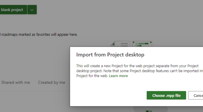
One of the features released in May 2021 is “Import your .mpp files to Project for the web through Project Home”.
To give you a reason why this is a big announcement. Project desktop client is a great product for project planning and tracking by single user.
Now, project management is decentralized and almost every stakeholders wants to be involved in project planning and execution for which Project desktop is not the solution. Project desktop doesn’t have collaboration features to support editing as well as viewing the plan simultaneously or even give real time feedback.
Project for the web is a cloud-based project management solution with capabilities to customize its experience to meet your organization needs and also it can be used by managers and team members at the same time. What’s even more is now you can import the .mpp file to Project for the web to start this journey.
I spent a few hours on this new feature – Import your .mpp files to Project for the web through Project Home. This post is my experience and what you should be aware of about this feature.
Sensitivity labels, also called Microsoft Information Protection sensitivity labels, makes it possible to protect the sensitive data. At the time of writing this post, sensitivity labels can be applied in both Power BI Desktop (preview feature) and Power BI Service.
Power BI allows the user to change sensitivity label later but the label will affect only the selected content. This means the label does not trickle down to the downstream contents. For datasets, its downstream items can be other datasets, reports and dashboards. For reports, its downstream items can be dashboards.
This has changed! Power BI service now supports downstream inheritance (in preview).
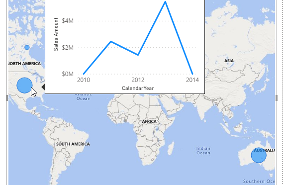
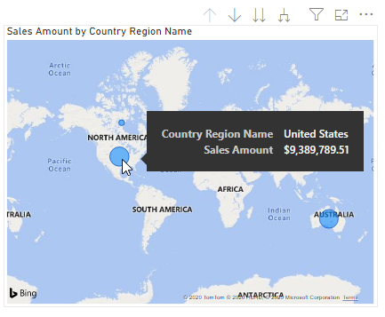
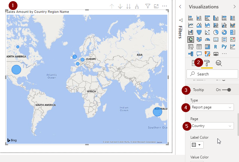
This map visual’s tooltip displays the country name and its sales amount. You can now enhance this tooltip to display additional context and information for users viewing the visual.
It is a simple process to create a custom tooltip.
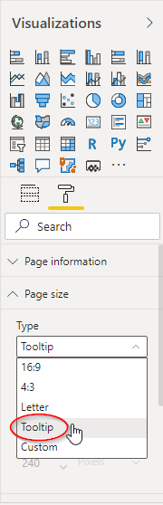
Step 1: Create a report tooltip page
You need to mind that tooltips display over the report, so you might want to keep them reasonably small. Then in the Format pane change the Page Size to Tooltip. This provides a report page canvas size that’s ready for your tooltip.
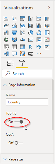
Step 2: Register your tooltip report page
You then need to configure the page to register it as a tooltip, and to ensure it appears in over the right visuals. In Page Information, turn on Tooltip
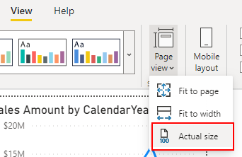
Step 3: Change the page size
By default, the report canvas fits to the available space on the page. To know how the tooltip would appear on the visual select Page view > Actual size.
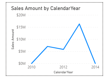
Step 4:Create the Tooltip visual
Step 5: Manually setting a report tooltip
As per the documentation, “You specify which field or fields apply by dragging them into the Tooltip fields bucket, found in the Fields section of the Visualizations pane” but Tooltips fields bucket is not available in the new Filters pane. So, I suggest manually setting a page to the visual.
Select the visual for which the tooltip should be displayed. Then in the Visualizations pane, select the Format section and expand the Tooltip card.
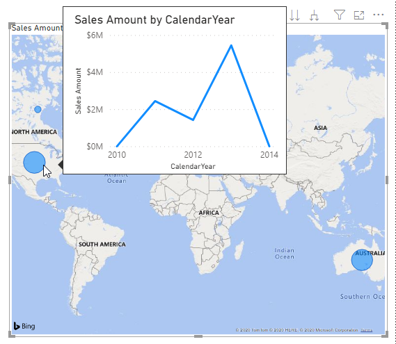
Now, hovering over the country name, say United States, the country name is passed as filter to the Tooltip page and the tooltip displays the Sales amount over time for that specific country.